Today, I’m going to give you some tips on how you can take your Facebook fan page to the next level, without hiring a designer or marketing consultant.
Put your images to work for you.
Your Facebook page offers two great places to get the most out of images. Since you can’t do too much to personalize your page, it’s important to take advantage where you can!

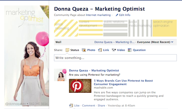
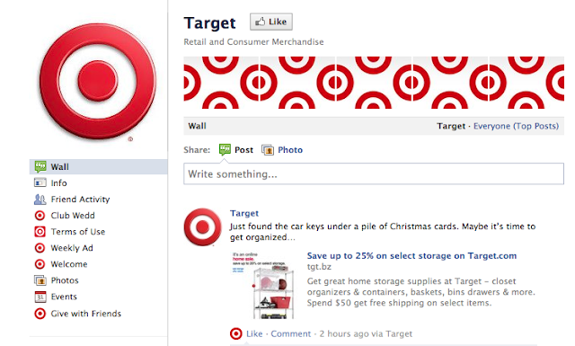
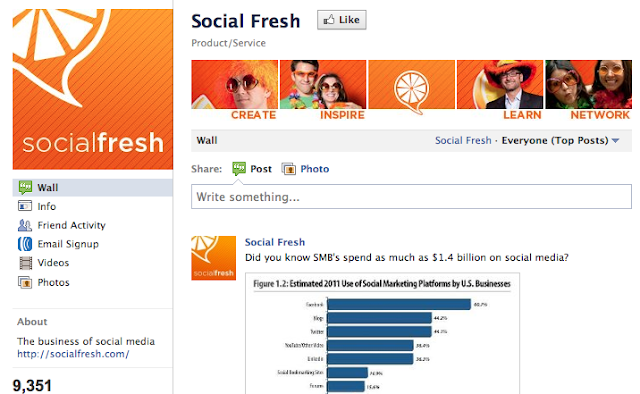
The first section you can try out your handy work is with the profile image. Did you know your profile image can be up to 180 pixels wide by 540 pixels high? That’s a lot of real estate! You can include your logo, an image that displays your work, your contact information, even a special deal or discount.
KEEP IN MIND: Your thumbnail (the small image shown when you post an update) will be a square (up to 180 pixels by 180 pixels). If you do decide to craft a tall page image, make sure you have a square that you can pull out that will make sense out of context. Don’t be that person with half a face or two letters of a logo.
Are you thinking, “I can’t do that, I don’t have fancy design software.” Take a deep breath my darling pessimist. You can find free online solutions here. (And, if you’d like a video tutorial on how to use the tool to piece together images and create a great profile graphic, leave a comment below and I’ll post something just for you on my blog!)
Now, wouldn’t you love a great header running across the top of your page? Good! Because that’s what we’re going to work on next.


I use my photo strip to add a list of my services to the top of the page.
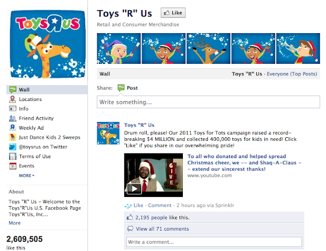
KEEP IN MIND: The images in your Facebook fan page photo strip will not appear in any particular order. In fact, the order will change each time the page is refreshed. So, we’re going to work on five images that work together, but not that string together to form on panoramic image.
Images in the photo strip are small (97 pixels wide by 68 pixels tall). Use clear graphics and short copy to get the most out of this little space. Again, use your photo editing tools to size accordingly so that you can get an idea of what your strip will look like to scale.
By default, the newest images that you post will show in the strip. To remove them (and get back to your desired photos), simply hover over the image and click the time ‘x’ in the top right corner.
Once you do these updates, I’d love to see your page (and “like” it, too). Please make sure to find me on Facebook or Twitter and let me know how it turns out. And, if you make it through all of this unscathed, I’ll be posting a tutorial on creating a custom welcome tab on my blog soon, so make sure to stop by!
I work with small and mid-sized businesses to help them reach their online marketing goals. You can learn more about my company at http://marketing-optimist.com


2 comments:
Fabulous tips Donna! Love it! Keep 'em coming!
Thanks, Carson. Facebook is not too flexible but it's cool that there are a few things companies can do to stand out!
Post a Comment